

Project Overview
State Street is a global financial services leader across investment services, markets and financing, and investment management. With a growing focus on attracting and retaining clients within the Alternatives segment, the global Product Team looked to Digital Experience (UX/UI) to identify design opportunities that would improve the user experience on the My State Street (MySS) platform.
Role: Lead UX/Product Designer
Team: Business Segment Owner, Product Owners, PM, Developers, HF Researchers/Co-ops
Tools: UX Research and Design, Design Thinking, Stakeholder Interviews, Usability Sessions, Wireframing/Prototyping in Figma and Sketch, Development Documentation, Client Communication
Impact Summary: Spearheaded redesign of a core enterprise IT tool used by 650+ users, increasing engagement and task success rates through iterative testing and stakeholder alignment.
Overview: The primary goal for this project was to empower Alternatives segment clients by facilitating direct access to their data and services in MySS. This includes developing an enriched user interface that not only caters to these needs but also enables users to craft personalized views pertinent to their respective roles. By achieving this, the project strives to enhance accessibility and usability, thereby maximizing the utility and satisfaction of our clients.
Team Structure
As the UX Project Lead, I drove the entire research and design journey, guiding the team from initial concept to product launch. Collaborating with a talented group of junior UX professionals, I delegated tasks to uphold a standard of consistency, accuracy, and punctual delivery. Additionally, I partnered closely with banking Segment Leads, Product Owners, Client Services, and Data/Development Teams to align user needs with project objectives and effectively resolve any arising issues.
| Phase | UX Lead | Product Leads | Engineering Lead |
|---|---|---|---|
| Discovery | Led stakeholder interviews of current products | Identified key users, framed business goals and constraints | Highlighted system dependencies and limitations |
| Define | Analyzed research data to personas and user flows; mapped current vs. ideal | Prioritized MVP functionality | Reviewed project feasibility and resource allocation |
| Design | Created low–high fidelity designs and prototypes; ran usability tests | Validated designs aligned with business needs | Advised on component usage and performance risk |
| Build | Supported engineers with interaction specs and design QA | Tracked progress and made trade-offs when needed | Surfaced blockers and UI inconsistencies |
| Post-Launch | Gathered feedback from internal users and iterated on components | Assessed business impact and adoption | Collaborated on phased design releases and updates |
My Process
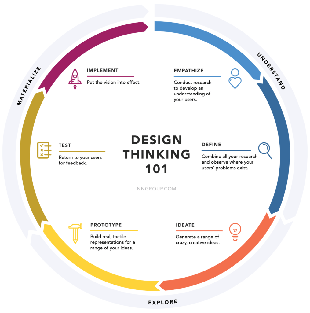
Our project embraced the Design Thinking process wholeheartedly, navigating through its iterative phases with precision.
Beginning with empathetic research, we delved into user needs and pain points, paving the way for ideation where creativity soared. Prototyping allowed us to breathe life into concepts, testing and refining them based on user feedback. Finally, we culminated our journey with implementation, ensuring that our solutions were not just innovative but also deeply resonant with the intended users. This holistic approach ensured that our project evolved in lockstep with user-centricity and innovation at its core.
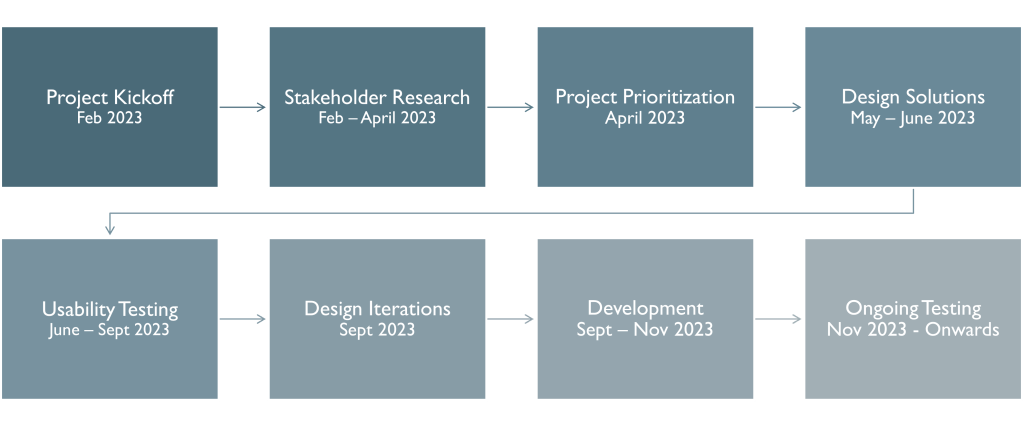
Project Timeline
| Phase | Activity | Description | Completed |
|---|---|---|---|
| Research | Competitive Analysis | Understand competitor offerings and UX standards | February 2023 |
| Research | Product Demos | Learn about key products available to clients, including the product history, ongoing strategy and development goals | March 2023 |
| Research | Stakeholder Interviews | Identify key performance indicators, challenges, and success factors | April 2023 |
| Prioritization | User Flows | Create diagrams showing the path users based on persona take in an application to complete a task | April 2023 |
| Prioritization | Prioritization Plan | Prepare initial draft of planned design releases for segment review | April 2023 |
| Design | Design Shares | Collaborate with internal design team to ideate solutions and allocate tasks to junior UX Designers | May 2023 |
| Design | Wireframes | Starting with low-fidelity concepts, iterate and lead to pixel perfect high-fidelity wireframes that communicate user actions | June 2023 |
| Design | Prototype | Collaborate with prototyping team to translate designed wireframes into clickable prototypes that match testing scenarios | June 2023 |
| Testing | Plan and Recruitment | Write and review usability script to test usability of the prototype while engaging business leads to identify and recruit the best and relevant clients for product testing | July 2023 |
| Testing | Usability Testing | Gather an accurate sample of users to test the usability of the clickable prototype based on planned scenarios | September 2023 |
| Design | Wireframe Updates | Synthesize usability findings and make any design updates based on feedback from users or business stakeholders | September 2023 |
| Design | Prepare Design Specs | Develop stories for Jira that document product stories with acceptance criteria for development | September 2023 |
| Development | Agile Development | Collaborate with development team to discuss product backlog and address issues with data or design during the process | November 2023 |
| Development | Design Resources | Create internal documentation for client service teams and schedule demos to engage teams with resources available | November 2023 |
| Development | Communications | Identify list of users and craft email messaging informing users of upcoming changes to their homepage | November 2023 |
Competitive Product Research

Identified that our product was lagging behind our competitors and needed additional features to be competitive in the marketplace.
Stakeholder Research Findings
Interviewed 26 stakeholders representing a global cross-functional internal team. Included business segment leads, product teams, IT leads, and client services. Goals were to identify the products available to clients, what their typical user journey was, and was it different based on their role.
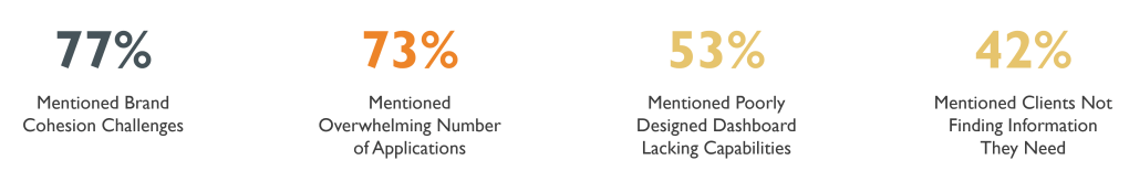
Existing Platform Challenges

Users need to access multiple products to get all the data they need
Experience feels outdated, lacks features, and has slow data-loading speeds
Individual products follow different design patterns
Homepage does not direct users to items that require their immediate attention
Identifying Client Priorities

Thematic analysis of research identified key data needs and priorities for clients. This information was used to identify what cards belong on the homepage, what data should be included, and how we should prioritize development.
Creating User Personas
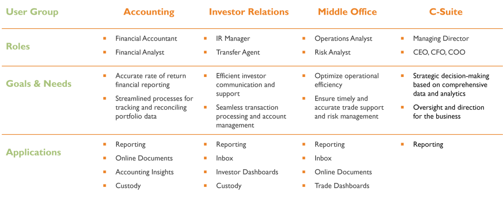
Clear differences in data needs and priorities were identified in the four primary user groups we identified. This helped in project prioritization, ensuring that we had planned content in each phase users would benefit from.
Design Process
The design process followed design thinking methodology and collaboration with other UX Designers and Product Owners. Initially starting low fidelity with simple sketches and mockups, I moved forward to utilize design system components and tools including Figma and Sketch to create clickable, interactive prototypes that were designed for future usability testing.
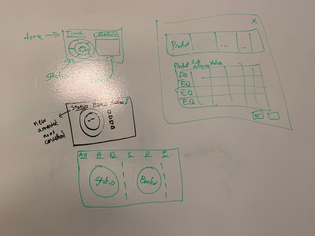
Step 1: Gathering Insights from User Research
Leveraging findings from rigorous user research, particularly through methods like card sorting, I distilled crucial elements for the dashboard. These initial low-fidelity sketches on a whiteboard were instrumental in visualizing layout concepts and early interaction patterns. Collaboratively, we refined these sketches by eliminating confusing concepts and aligning with stakeholder priorities.
Step 2: Iterative Refinement Process
Continuing from the initial sketches, the focus shifted to fine-tuning each design element within the cards. Decisions were made regarding the inclusion of specific data points and time periods, a process rooted in collaborative discussions and iterative refinement.

Step 3: Utilizing Design System Components for Wireframing
Transitioning from sketches, I utilized our established design system components within platforms like Figma and Sketch. This facilitated the creation of more detailed wireframes, ensuring consistency and expediting the visualization of card functionalities.
Step 4: Development of High-Fidelity Prototypes
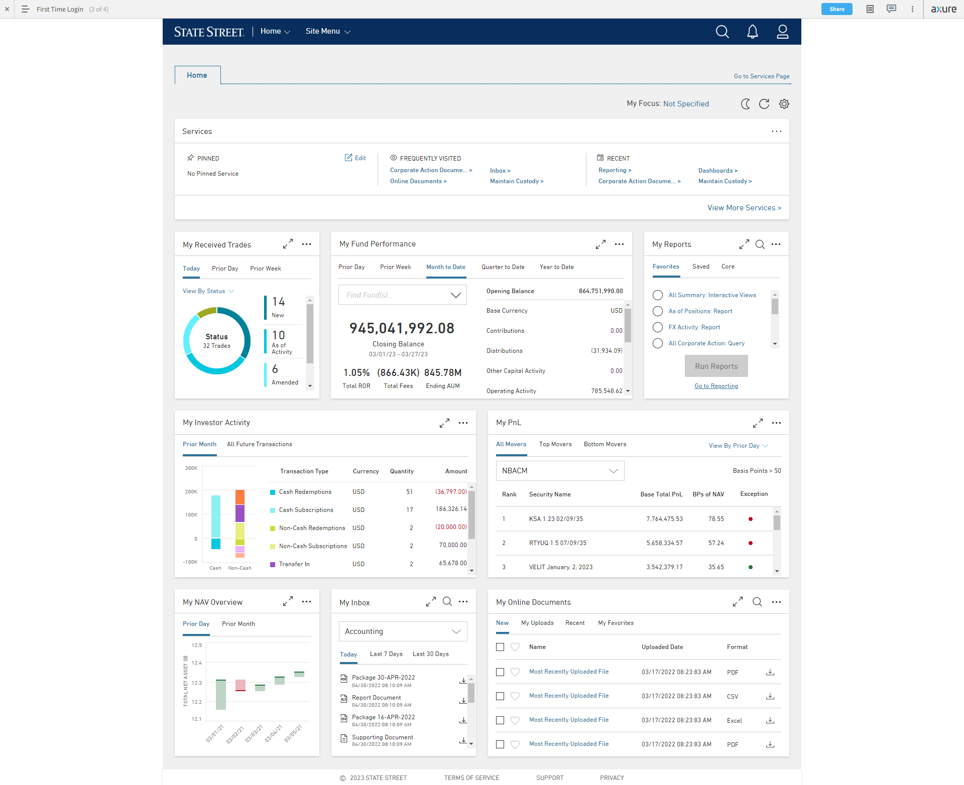
The culmination of this process resulted in the creation of pixel-perfect high-fidelity prototypes. These prototypes meticulously outlined every UI element and interaction, allowing for the visualization and testing of various user scenarios within the dashboard. Feedback loops from user testing further refined these prototypes, ensuring a user-centric and meticulously crafted final product.


Usability Testing
Goal: To understand how the designed elements on the prototype homepage align with the user’s workflow and goals
Setup: 60-minute virtual sessions hosted on Zoom by UX Moderator, Note Taker, and Observer.
Process: Participant is sent a public link to the prototype and asked to share their screen. The Moderator then proceeds to ask the user to complete a series of tasks, walking through relevant cards and asking them to think out loud with no answers being right or wrong.
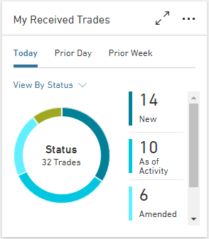
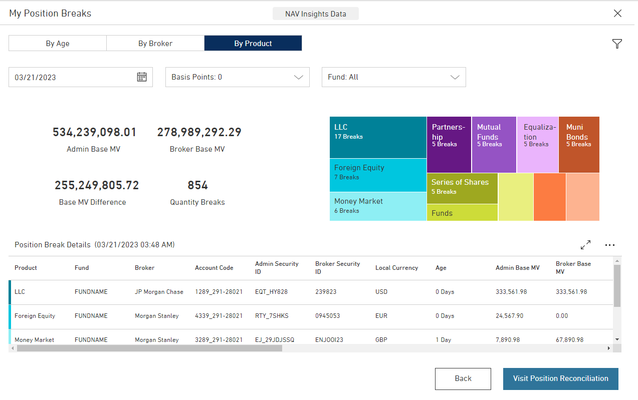
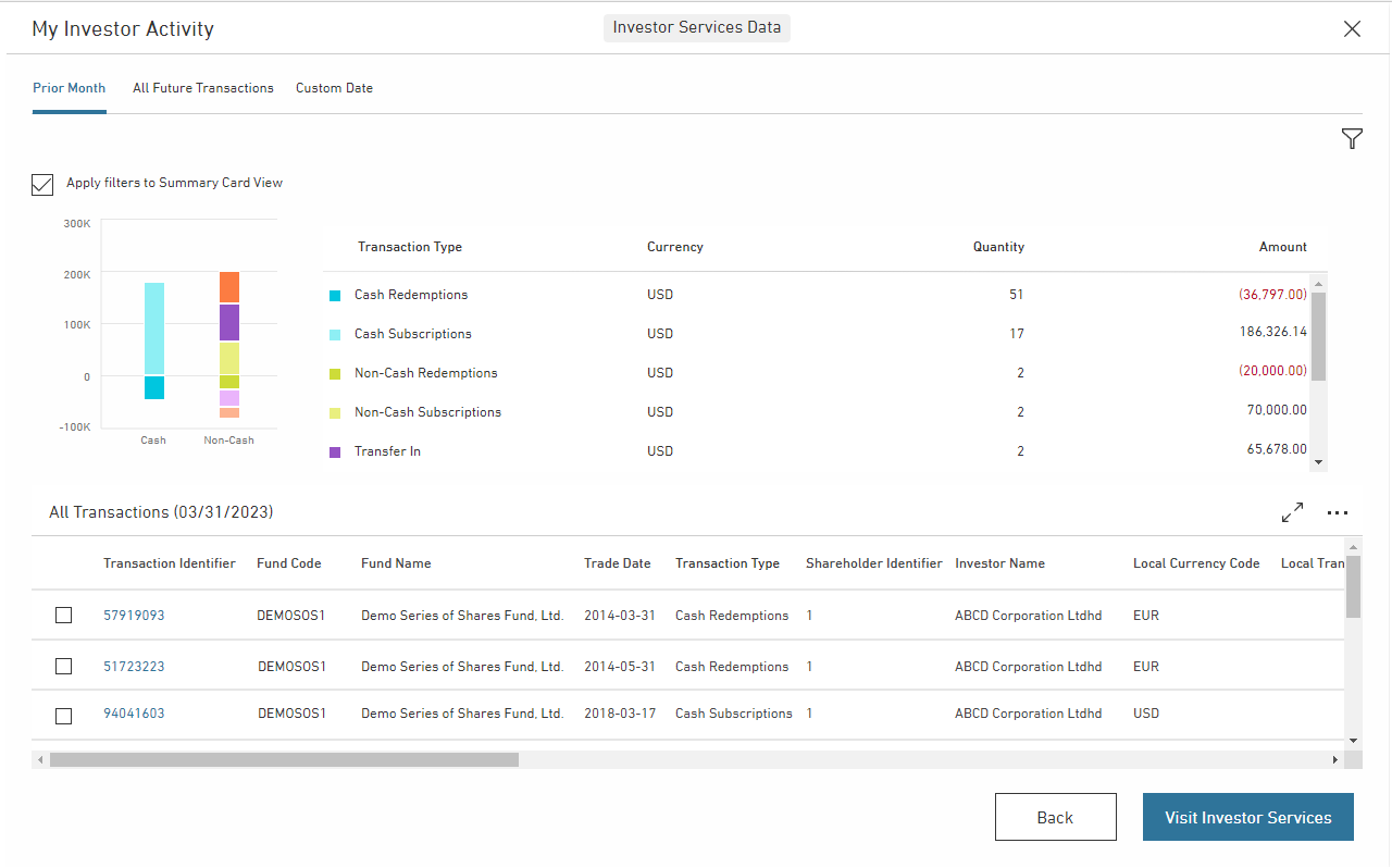
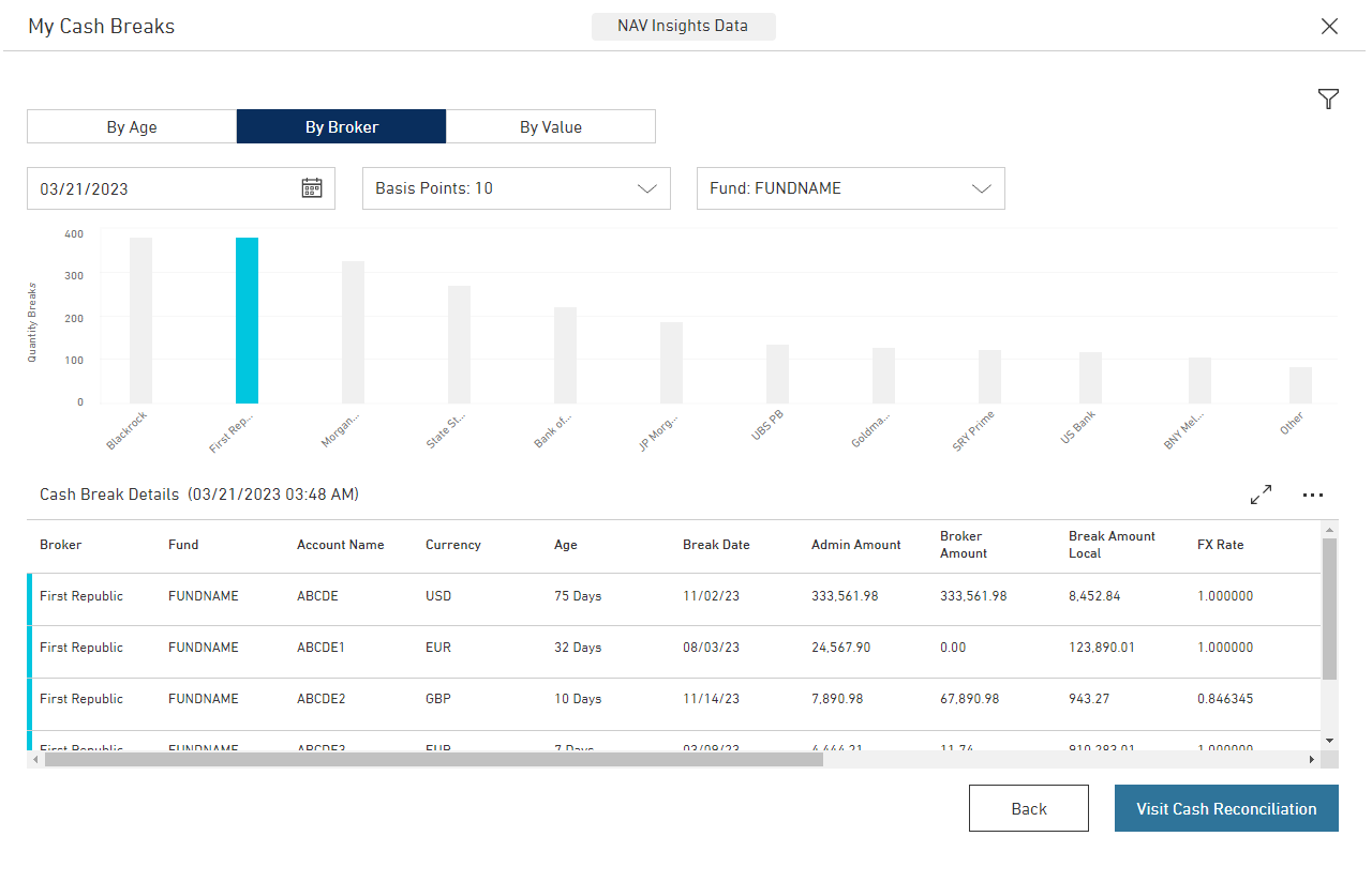
- Trades card naming changed due to confusion from users
- Graph on Investor summary card removed in favor of broad net total value metrics
- Accounting “daily” periods removed from card in favor of “monthly” and “quarterly ranges”
- Add messaging in onboarding/tutorials on usage of basic card functions

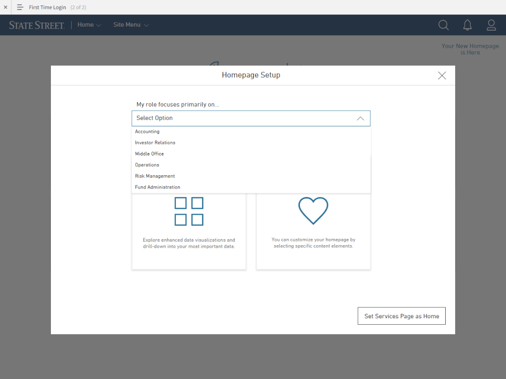
Onboarding New Users
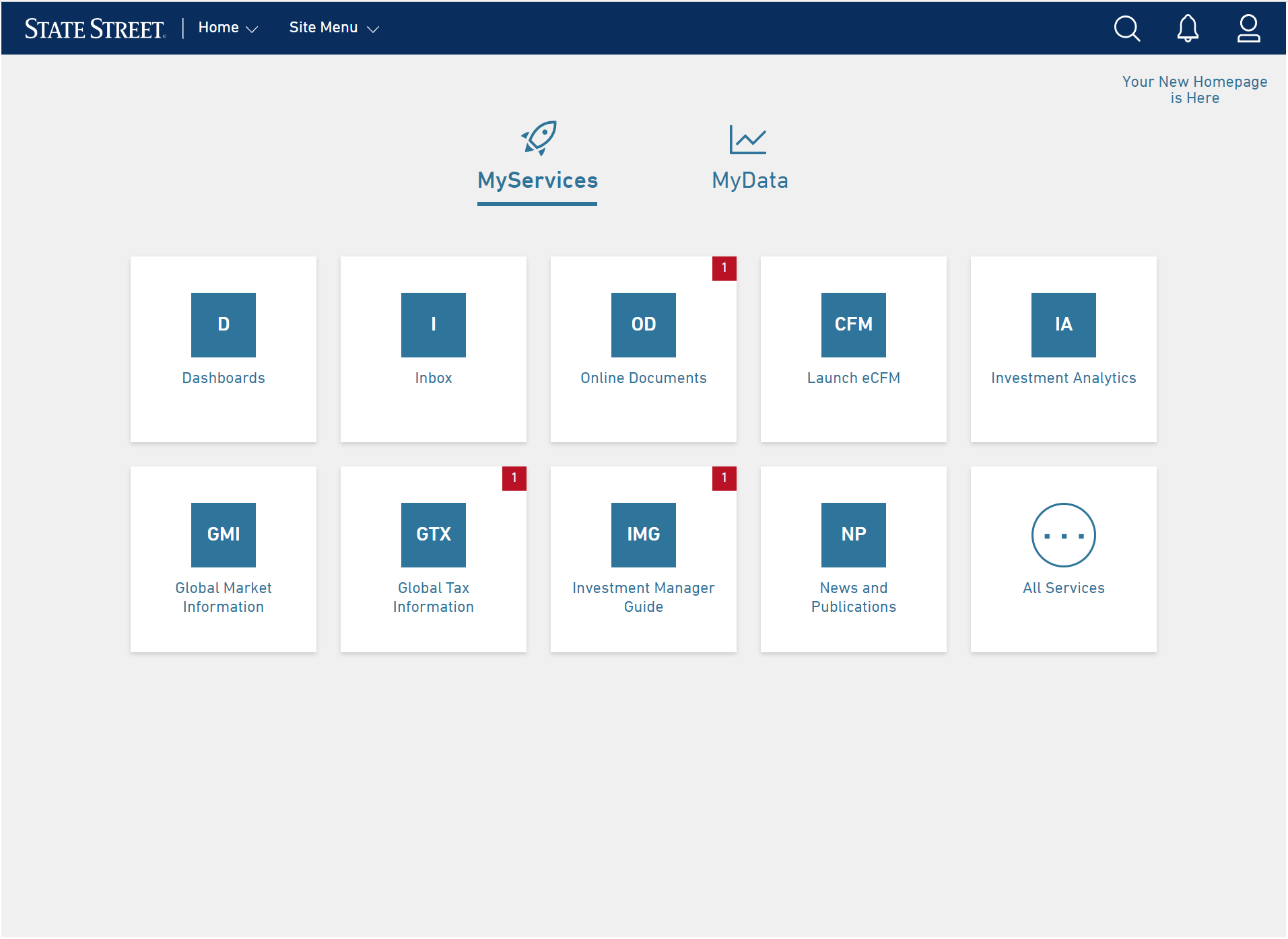
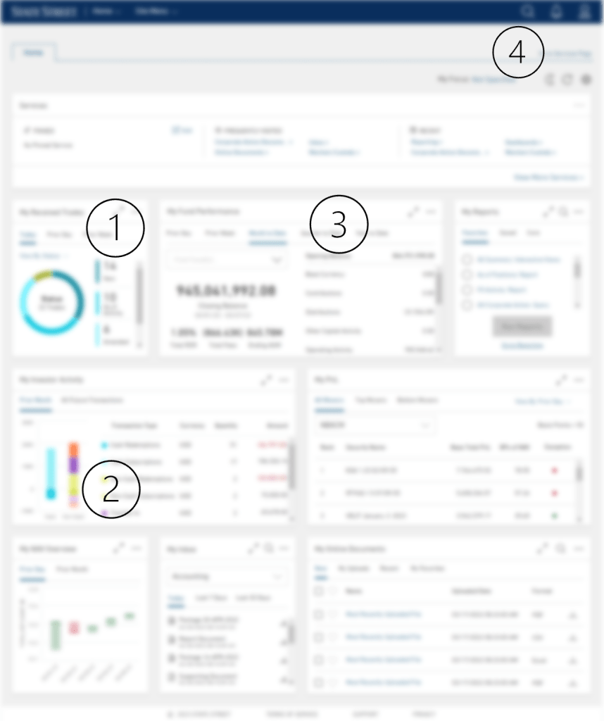
Creating a welcoming and effective onboarding experience for both external clients and internal stakeholders to a personalized dashboard is crucial for ensuring a positive first impression and successful utilization of the platform. The following are screens I designed to introduce new users when our product launched.

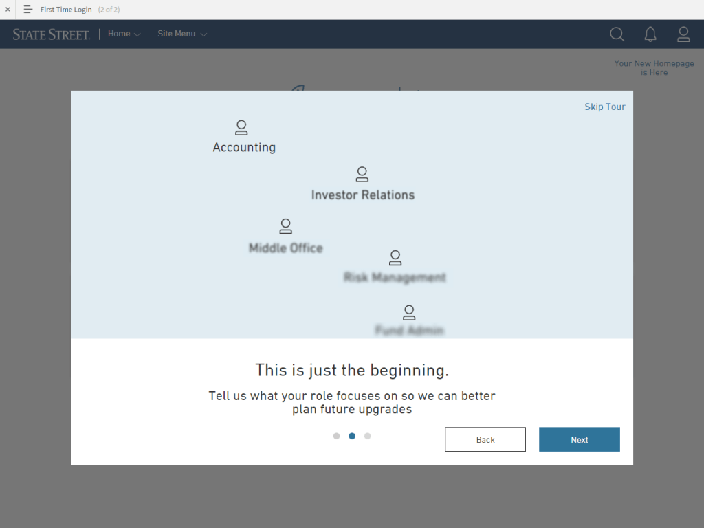

Once users go through the simple onboarding process, they select to Set Up Their Homepage. The following steps were designed to allow a user to go to an auto-generated homepage based on their role, or allow them to customize what cards were displayed.


Outcomes
I think that this is definitely a more user-friendly view than the current homepage. Thinking about how my colleagues will utilize this page, we should definitely see more usage than we have in the past.
Lawrence, Financial Analyst
I think generally it looks pretty good. I mean, it looks very self-explanatory. It’s got good visuals, so more of that makes sense.
Rebekah, CFO
- Minimized effort to find information
- Prioritized data through visualization
- Consistent experience
- Data flexibility
- Enhanced data interpretation
- Progressive disclosure

Challenges
- International Clients and Stakeholders.
- Shifting data needs and product migrations.
- Existing negative association with current experience.
