
Project Overview
Boston Children’s Hospital is a children’s hospital located in Boston and affiliated with Harvard Medical School. It has the largest hospital-based pediatric research program in the world. The hospital provides comprehensive pediatric specialties and subspecialties to infants, children, and teens. Care of these patients may continue throughout their adult lives. Patients at Boston Children’s Hospital provided feedback that their patient portal was difficult to navigate and distinguish important information through visual clutter.
The primary goal for our design team was to evaluate the structure and visual layout so crucial hospital information is easy to find – whenever users need it. This included:
- Moving all but crucial hospital information from the right side of the portal homepage
- Reorganizing and consolidating the information about using the portal
- Answering questions that currently go to our support team
Current Platform Constraints
- The portal consists of 3 systems: EPIC (Billing, Visits, Non-Medical Messages, My Contact Information) Cerner (Health Record, Medical Messages, navigation) and our custom pages (login, sign up, homepage, Account, Messages landing, Schedule Visit, Request Visit)
- Can only include custom instructions at the top of Cerner page and top and right/bottom of Epic pages (lo Billing Summary is an example).
- Navigation within portal is limited to the left navigation bar/hamburger menu
Project Team
Four person team of UX Designers. In addition to UX research and design, I served as the meeting facilitator and process checker. Responsibilities were keeping team on track during meetings, setting the agenda, monitoring team progress, raising questions about our approach when necessary.
Our Process
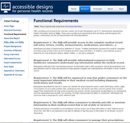
Our team began by conducting research on functional design requirements, barriers and needs of patient portal users.
Key Findings
- Previous studies of patient portals have found low rates of enrollment and significant disparities in enrollment by race and ethnicity.
- Strategies to increase enrollment in patient portals need to ensure patients understand patient portal features and receive follow-up reminders.
- Incorporating features—such as detailed explanations of medications and procedures, medical term glossaries, alerts for relevant articles about treatments, and supplementary multimedia resources—can help reduce uncertainty about their health.
Creating The Design System
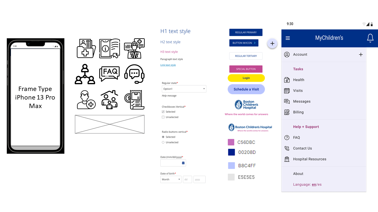
In the next phase of the project, our team reviewed the style guide provided by the client and created a design system that we would use to keep our wireframes consistent.
Creating a User Persona

Meet Alex & Jacob
Single father Alex who is looking to help manage the care of his 12 year old son Jacob. As Patient and Parent at BCH, their goal is to easily manage aspects of their care through the PatientGate Portal so they can spend more quality time together.
By putting ourselves in Alex’s perspective, we were able to find opportunities to simplify the user interface and introduce new features that enhance the overall experience.
Design Process
With research, a design system and persona in place, our team was ready to move forward with sketching and building wireframes that met the clients user stories. Below are my personal design contributions to the project.
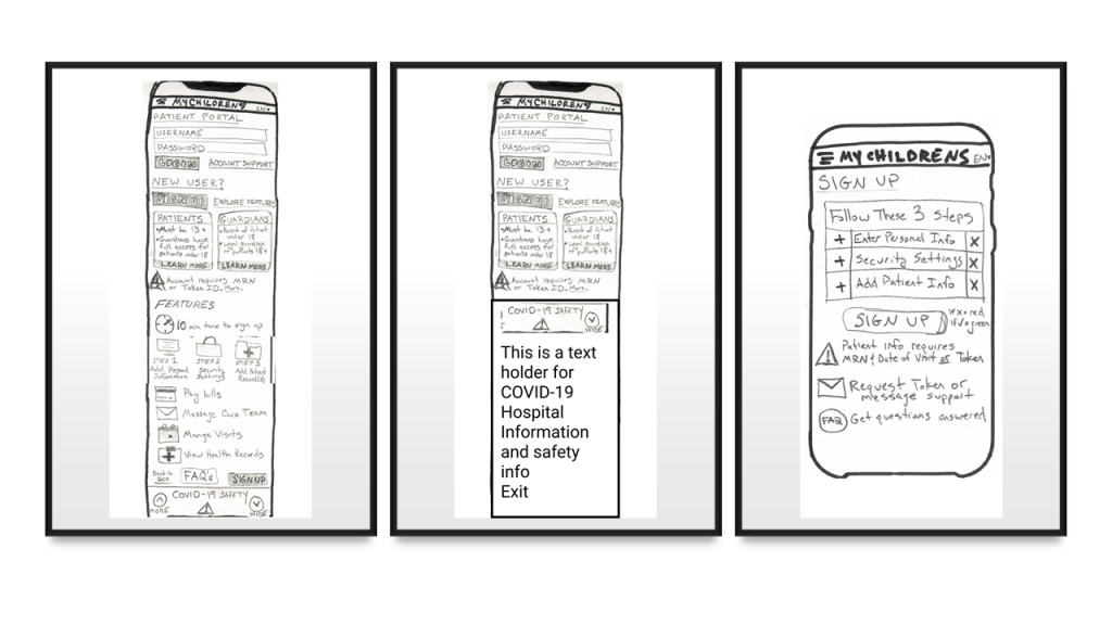
Step 1: Low Fidelity Sketches
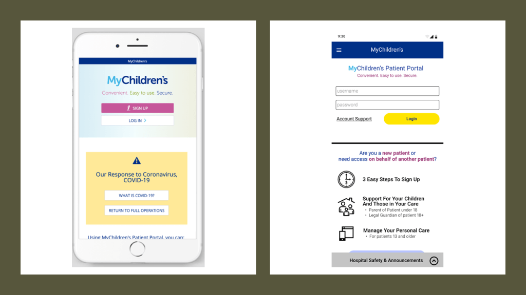
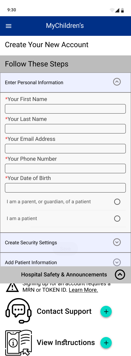
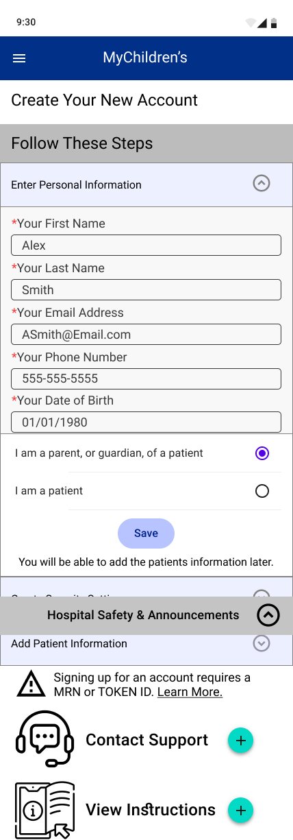
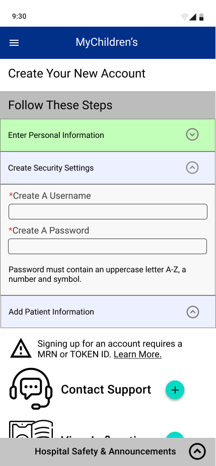
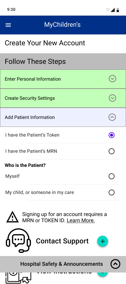
Initial sketches focused on the process before signing up for an account, and informing users of the key benefits of the portal, who can have an account, technical requirements, and how to sign up, so that users know it’s worth their time to sign up and can do so easily.
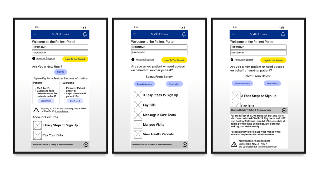
Step 2: Design Iterations Using Design System Components
Wireframing begins, using design system elements to visualize sketches within guidelines. Iterative design updates based on collaborative feedback with other UX Design team members.
Input from Design and Usability Testing
To get to my final design, I tested my sketches and low fidelity wireframes. The following quotes were noted and incorporated into my final design.
“Big issue is not understanding who can sign up for what type of account.”
“Collapsible footer helps keep real estate on the screen focused.”
“A lot on one screen for the new user; need to simplify it down”
“Don’t need to go into this granular detail at this high level page.”
– Usability Interviews
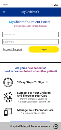
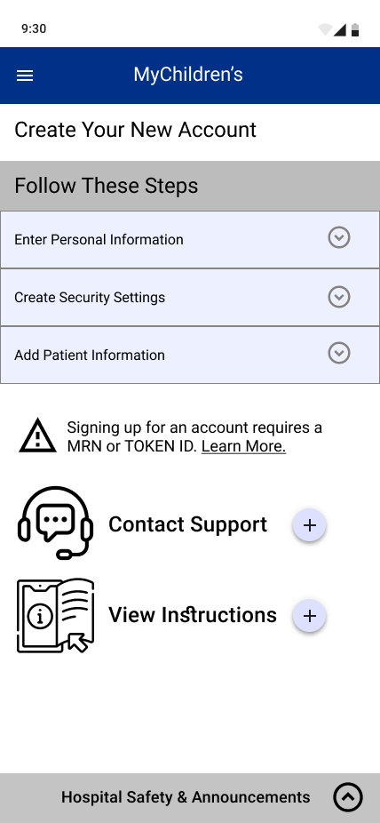
Step 3: High Fidelity Sketches
Create pixel-perfect wireframes that go through each UI element frame by frame to build out all potential user scenarios within the card interactions.
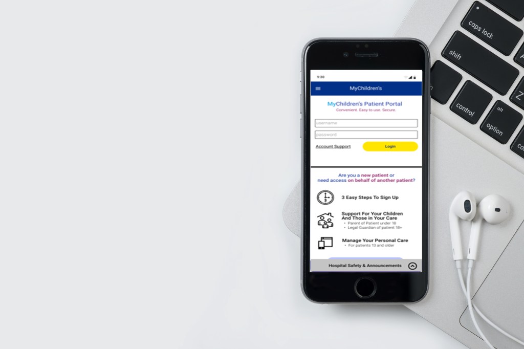
- Site Entrance: Focus on quick login fo rexisting patients with a reduced number of CTA buttons on screen in order to better direct attention
- Reinforcement: Summary using iconography to define who portal is for and what they can use it for
- Announcements: Collapsible bar function added to save real estate space on mobile


Outcomes and Challenges
At the end of this project, our team presented our interactive prototype to the Boston Children Hospital client. The value proposition we sought to bring to our client included:
- Streamlined the sign-in and log in process
2. Redesigned homepage to showcase critical information
3. Added a comprehensive internal help and support section
4. Rebuilt the navigation system for improved information architecture
Despite these positives, some challenges we faced included:
- UI interface limitations, including the portal utilizing three different vendor systems.
- Need for Patients and Guardiants (two user types) to create accounts and access the system
- Patient privacy laws limiting research and data available.
In conclusion, our design team worked together well, and from the beginning we created a schedule of when we would meet, and generally stuck to it. Overall we had good communication, and always managed to have deliverables ready on time and without stress of last minute hassles.
