

Project Overview
Walgreens is a prominent American pharmacy chain known for its retail stores offering pharmaceuticals, health and wellness products, and services. With a widespread presence across the United States, it provides a range of healthcare services, including vaccinations, prescription refills, and wellness consultations. With a growing focus on staying protected and keeping those around you from vaccine preventable diseases, being able to effectively and efficiently schedule a flu shot is vital in keeping a community healthy.
The primary goal for our design team was to assess the experience design of the Walgreen’s website and improve usability, value and overall experience for customers while scheduling their vaccination appointment. This included:
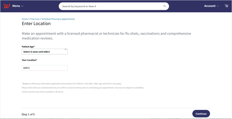
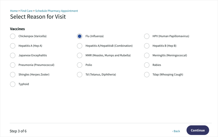
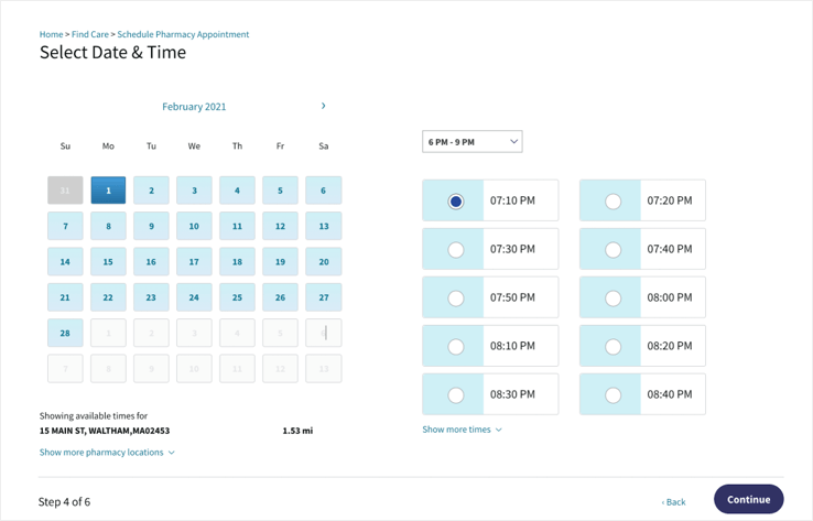
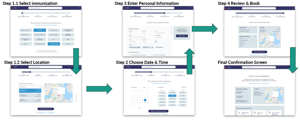
- Reduce total number of steps to complete the scheduling process
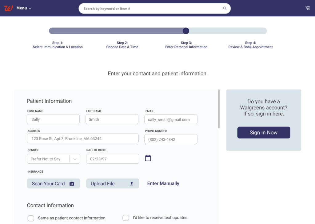
- Address accessibility issues through redesigned components
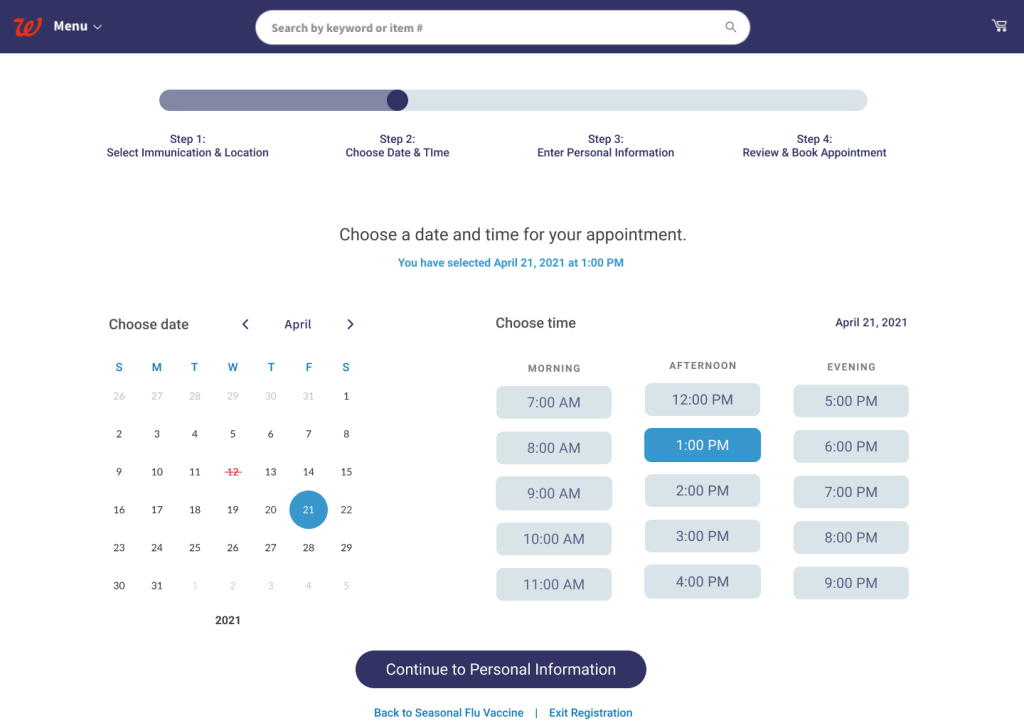
- Improve location/date/time selection and process flow user features
- Increase ease of use navigating through scheduling steps

Team Structure
Four person team of UX Designers. In addition to UX research and design, I served as the product owner. Responsibilities including user research, wireframing/prototyping, usability testing, and working to align user needs with project objectives and effectively resolve any arising issues.
Our Process
Our team process included creating a four week scrum focused project, focusing on an internal review, including an accessibility check and informal heuristic evaluation, where we identified usability problems and concerns that centered around content design and IA factors: legibility, UX writing, mechanics of appointment scheduling, navigation, user flow logic, and page duplication.
Project Timeline
Our team began the project by establishing a four week scrum timeline, and what would be prioritized during each sprint.
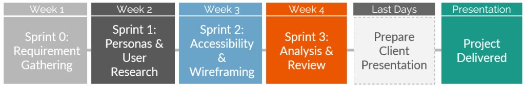
Week 1: Initial requirements gathering, sprint planning, product backlog creation, design review
Week 2: Develop proto-personas, perform user testing to gather qualitative research data
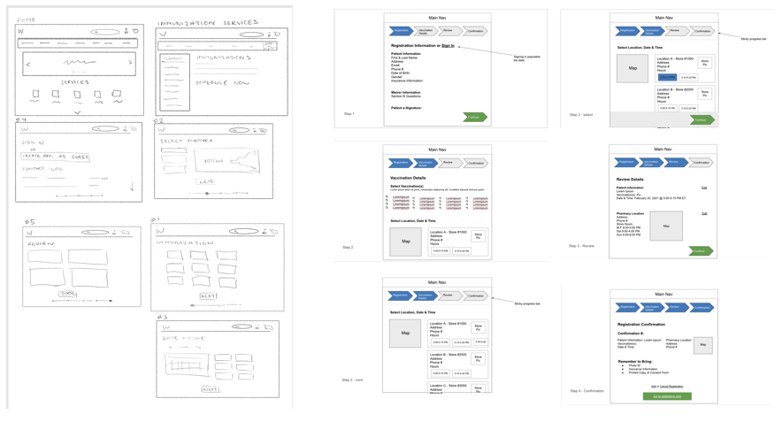
Week 3: Test website accessibility, begin development of low-fidelity wireframes
Week 4: Refine wireframes through analysis of client website strengths & weaknesses
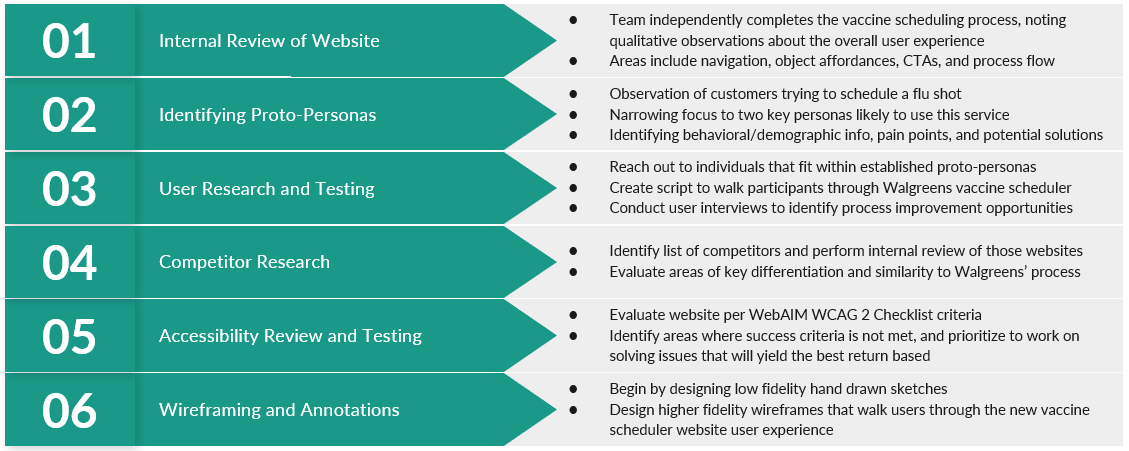
Within the four week sprints, we included the following six evaluation process steps.
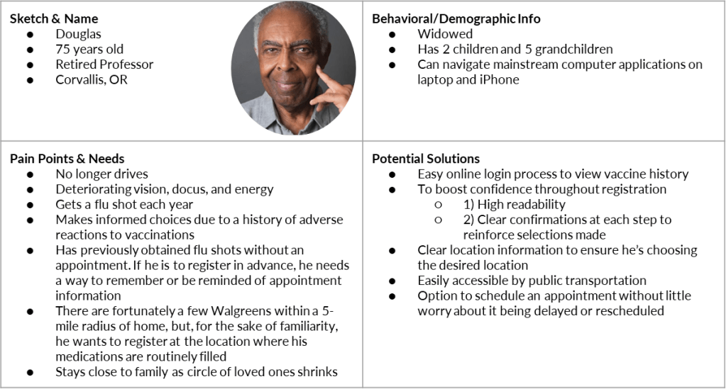
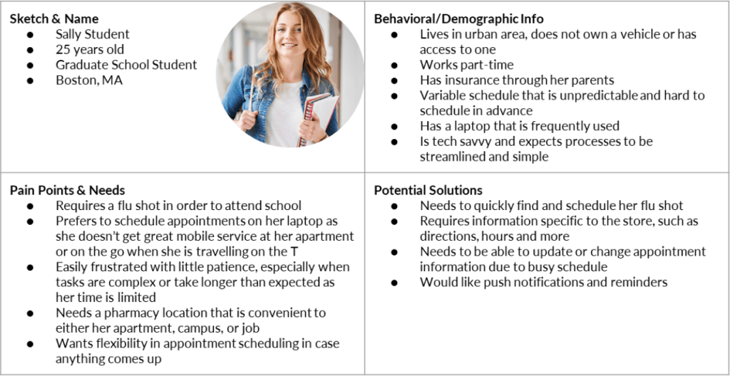
Creating a User Persona
Flu shots are almost universal in the sense that people of all stripes seek them. The team designed with a focus on two personas that drew from wide disparities in demographic and ancillary background data.
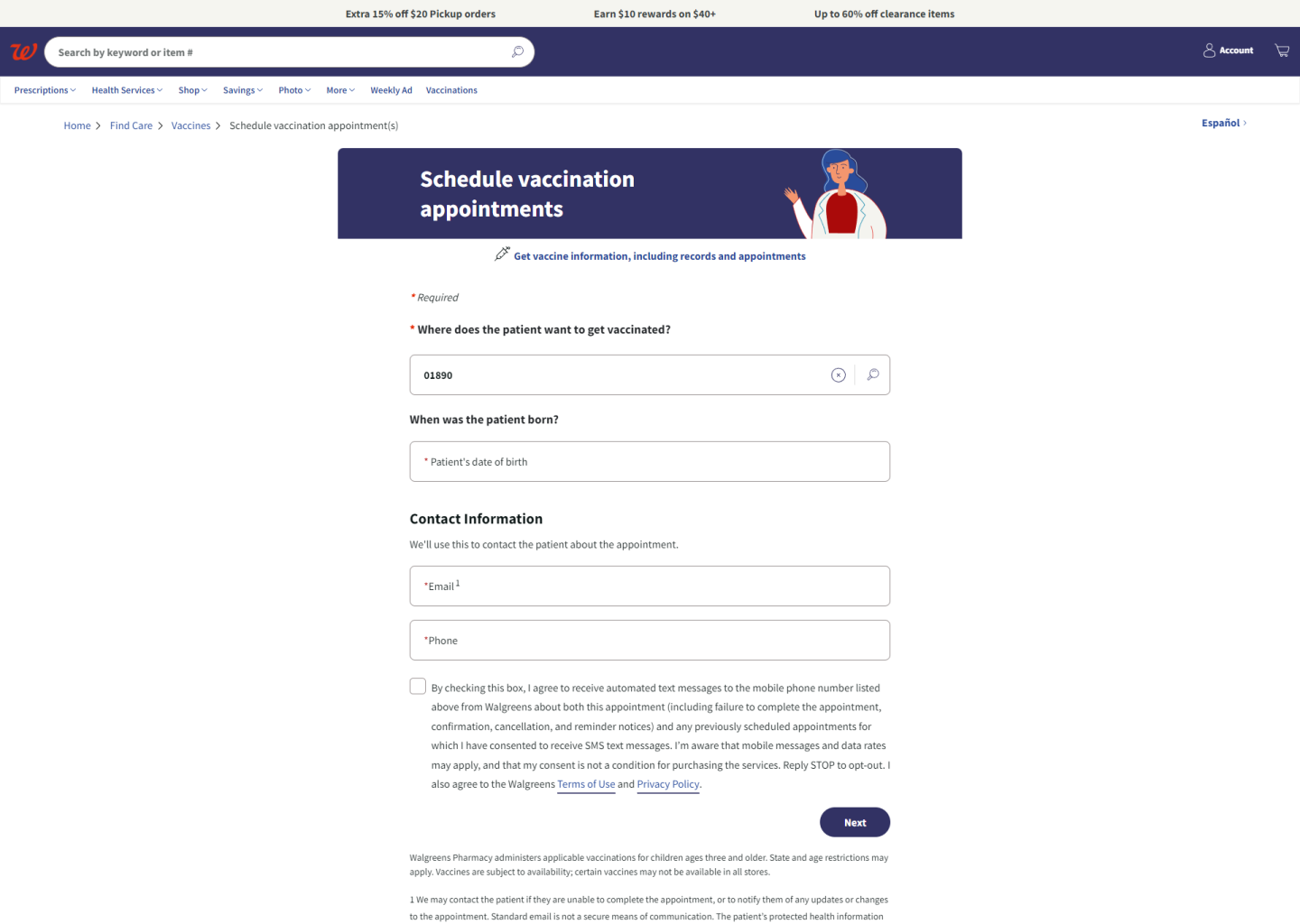
Current Experience Design Review
User research validated most internal review findings and showed mixed results with some (e.g. appointment scheduler). It also surfaced new pain points related to color palette and inconsistent user input button options.


“The drop-down menu on the global navigation is nice and consolidated, I feel it will take the user too much time to find what they are looking for”
“You can’t select more than one vaccine, which should be stated”
“CTAs are not clear here unless you start clicking around on the calendar and select the drop down and then specific time window”
Visual and text hierarchy is confusing, “Big block of color lumping all important information together”
Quotes from internal stakeholder research on current experience
Design Process
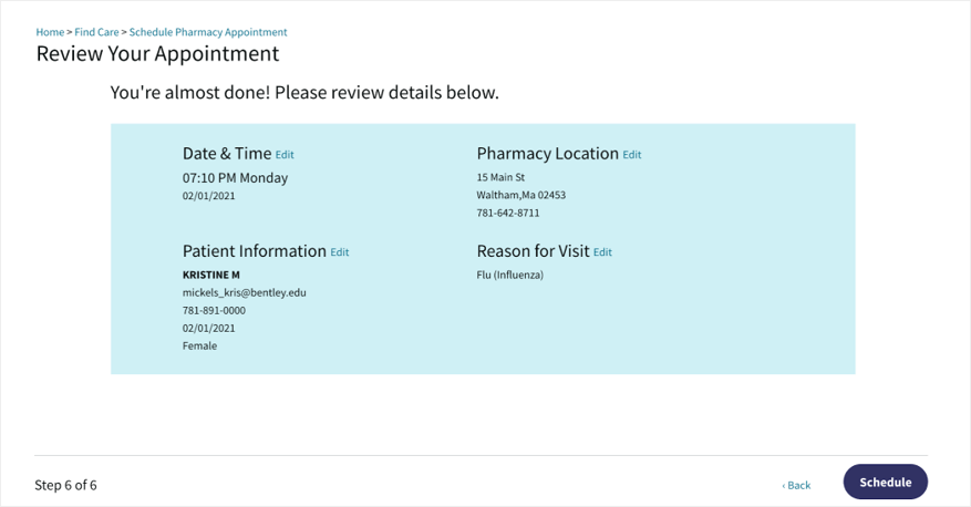
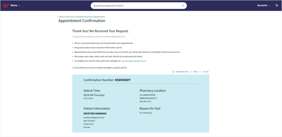
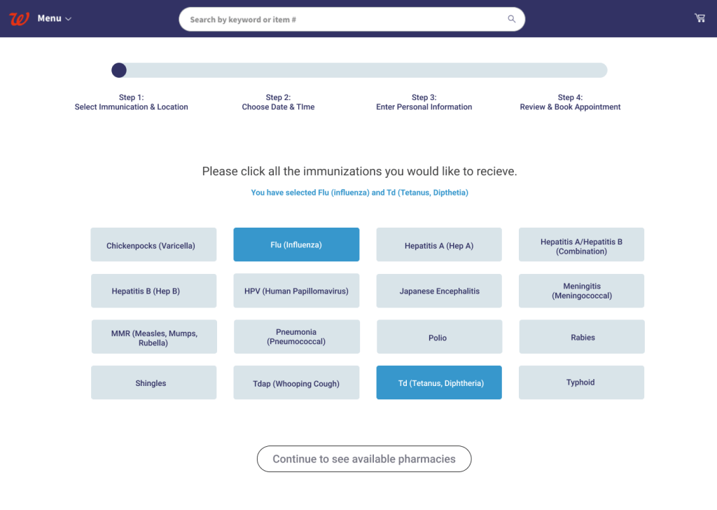
Our goal within this project was to ensure customer had an intuitive, quick, and informed vaccination registration process. Our proposed solution was to reduce the total number of steps taken to complete the process, address accessibility issues through redesigned components, improve location/date/time selection, and increase ease of use navigating through the required scheduling steps.


Challenges & Outcomes
This design experience was one of my first times operating in a Product Owner role, responsible for leading the strategy and direction of a team. While I found it challenging, I enjoyed keeping discussions and time focused on key decisions and strategic direction, rather than focused on executing tasks. This paired well with the experience I gained in my MBA program, and management of various interns in my professional career.
An additional challenge our team faced was balancing creative discussion and exploration with forward movement and decisions, especially in a time-constrained environment. While we faced this early on, we navigated this through assigning a team member to a time keeping role, in order to move our meetings forward and building in specific windows for exploration and ideation.
