
Project Overview
MITRE is an organization that operates federally funded research and development centers, supporting government agencies. As part of an initiative to better support employees with security clearances, the Classified@M product team partnered with User Experience Design to improve the site’s usability and overall effectiveness. This case study showcases how research-driven design led to a more intuitive and purpose-driven user experience.
Role: Lead UX/Product Designer
Team: Product Owner, PM, Developer, Content Strategist, HF Engineer
Tools: Heuristic Review, Personas, Qualitative Research Design, Usababilty Testing, Condens, Figma, User Story Mapping, Design System
Impact Summary: Increased user engagement/awareness and improved delivery speed of virtal enterprise resources, meeting business objectives for operational effectiveness.
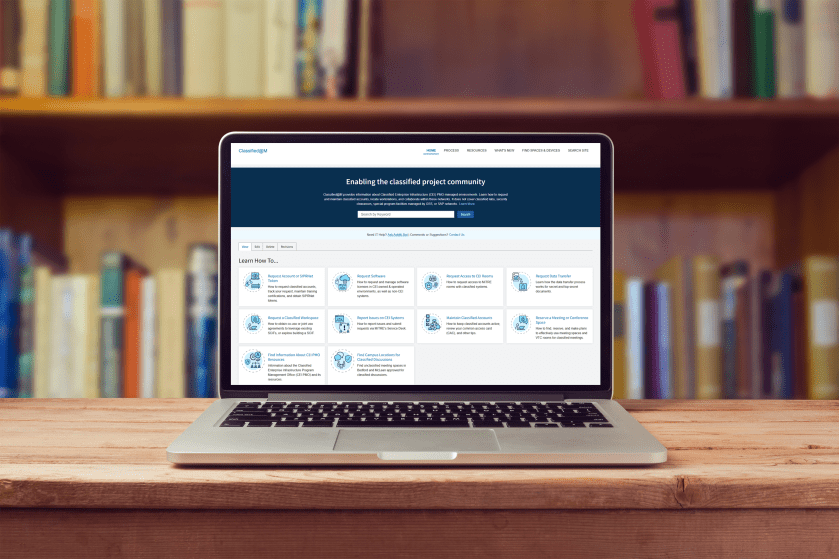
Overview: Classified@M is an internal MITRE platform designed to support employees working in classified environments. Despite offering critical resources, the site suffered from low awareness, poor navigation, and information overload. As the lead UX designer, I partnered with the product team to conduct user research, synthesize insights, and deliver targeted design improvements. Our goal was to enhance usability, increase site adoption, and ensure employees with security clearances could easily access the tools and information they need to do their jobs.
Research Usability Study
Objective: Evaluate users’ awareness and usage of the Classified@M site to better understand what resources they are searching for, what is valuable, and how to improve the user experience.
Process: Conduct interviews with cleared staff representing a broad representation of users from role, seniority, familiarity with the site, and time holding a clearance.
Outcome: Help inform the design and functionality of Classified@M, prioritizing user-centered design, and modernizing UI while helping bring awareness to the site for all classified users.
“I’m so glad to hear that we’re leaning into our in-house experts to enable our workforce!” – User Study Participant
User Research Goals
- Are they aware of Classified@M? If so, how frequently do they visit?
- What information are they typically searching for?
- Which areas of the site are most important?
- Are they able to navigate the site to efficiently find answers or valuable details?
- What recommendations or feedback do they have?
Collecting Research Data
Goal was to capture data from user sessions and prepare thematic analysis to identify key results and action items.
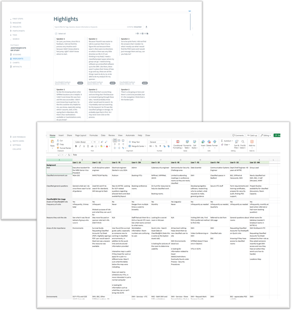
- Project was organized in Condens, which allowed video recordings to be uploaded, and transcripts generated
- Tagging transcripts allowed me to quickly pull out relevant and high-value quotes in addition to themes across users
- Additionally used Excel to organize results by user and question during the sessions allowing for quick comparisons
Presenting Research Findings
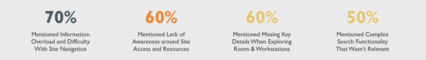
- The site is a valuable resource that offers comprehensive information and useful content, particularly the Asset Data, SMII, BSC/MSC, and Computing Guide.
- Users typically look for information such as room access and capabilities, requesting accounts/tokens, transferring data, and POCs.
- Majority of users indicated they were either not directly aware of the site or visited infrequently, once a month or when needed. More likely to reach out to a POC for information than searching online.
- Feedback indicated it would be a helpful tool for classified onboarding, although there is room for enhancement in site navigation, search functionality and content clarity in areas such as asset details and usage of acronyms.
User Journey: Finding items that are prohibited in a SCIF
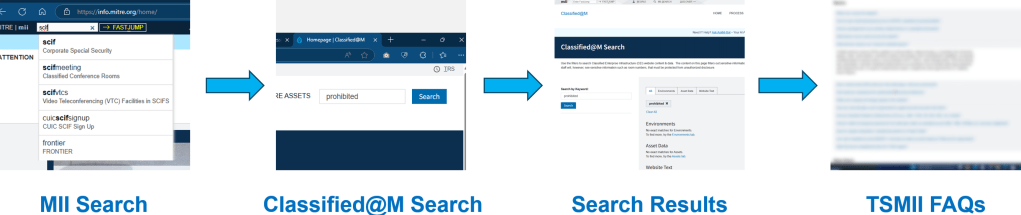
User wanted to see if their cay key fob was a prohibited item due to security concerns. They began their journey searching for the room type, using Classified@M to search, reviewing search results and then going through FAQs to finally find the information they were looking for.
User Journey: Find a conference room in McLean

User had upcoming meeting with sponsor with goal of using Classified@M to find a conference room to book. Began by searching for Classified@M, clicking a resources link, using facets and filters to narrow their search, and ending by clicking into a room in order to locate key room details that were missing.
Product Design Updates
Recommendations
- Increase awareness of the site through new employee and clearance onboarding, FJ search, referral links, and slack engagement.
- Simplify the site navigation by reducing number of links available, removing overlapping information, and providing quicker access to actions such as finding a room, learning about security procedures, and computing details.
- Provide additional room details including access restrictions, POC, # of seats, room name, and asset type clarifications to help users quickly locate results.
- Prioritize search and improve the keyword tool results page to help users quickly find site content and resources.
- Improve content clarity for users by defining acronyms, asset types, environments and other technical terms. Design new employee guides that help users navigate the classified world.
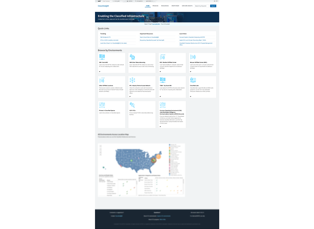
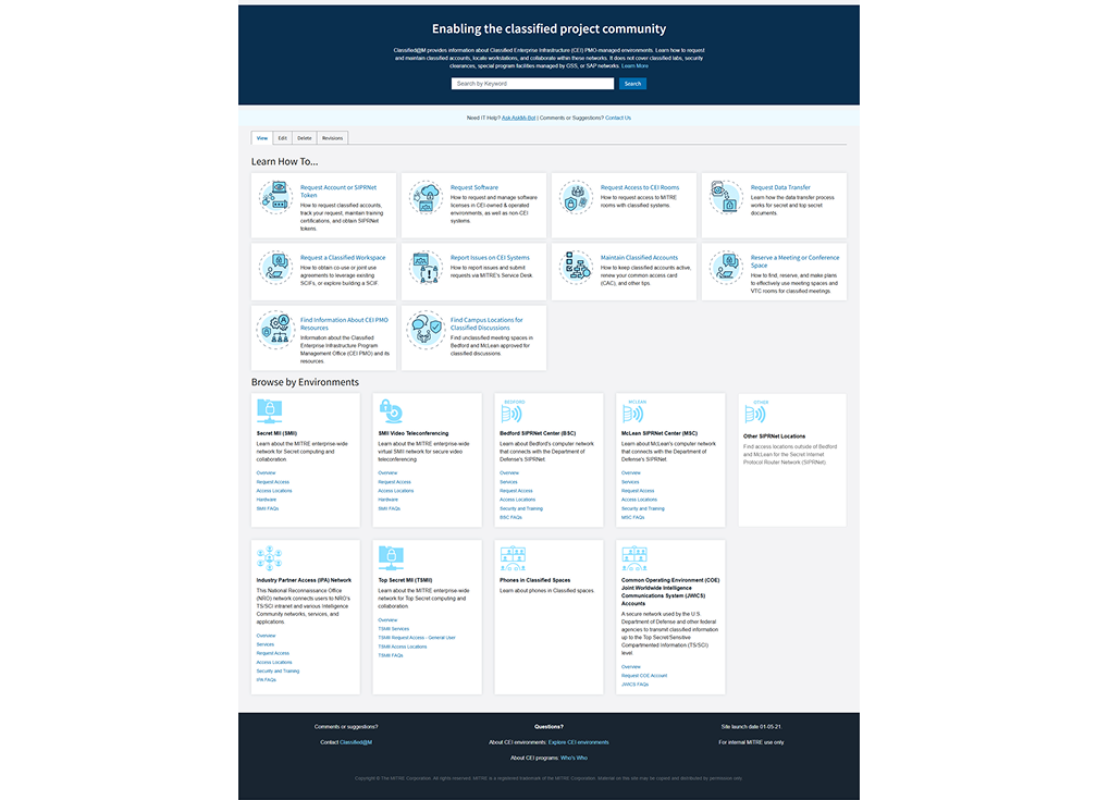
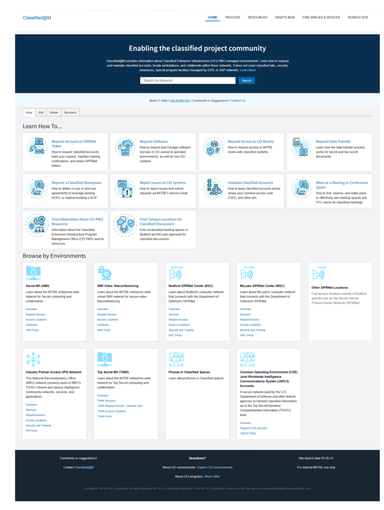
Homepage Redesign
Goal was to include UI updates to help streamline interactions and provide additional context around site content
- “Find Spaces & Devices” added to main menu
- Search Bar prioritized in UI with added text for user context
- Incorporated “Learn How To…” section w ith specific actions most frequently taken by users
- Additional links added to “Browse By Environments” allowing for ease of navigation and visibility into key content
- Removed locations map feature
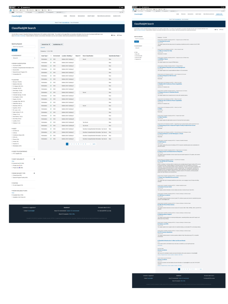
Find Spaces vs Search Site
Goal was to separate two different search functions, between informational content and room/devices users needed
- Find Spaces and Devices focused on finding rooms by type (workstations vs conference) and technology users need to do their jobs (phones, printers, scanners)
- Additional filters allow users to narrow down by location, clearance level, availability and more
- Search Site focuses on users looking for informational content included on the site, such how to request an account or transfer data
Sensitivity Clearance Banners
Goal was to provide added clarity to user because certain content is visible based on users’ specific clearance level
- Product is accessible by all MITRE employees, but some content is restricted based on their clearance level
- Refined Sensitivity banners added to pages with messages that provided extra clarity as to why that content was visible or not to the user
- Additional banner added to top of page to reinforce the message
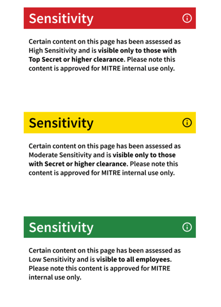
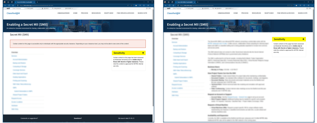
Designing so content can only be viewed by those with the correct permission level.
Outcomes
Erik conducted one-on-one user interviews to identify key pain points on the Classified@M website, providing valuable insights that shaped our approach to design and navigation improvements. His thoughtful recommendations and willingness to go beyond his role have been instrumental in driving meaningful change. I truly appreciate his outstanding work and dedication to enhancing the classified user experience.
Lisa, Product Owner
Ultimately we were able to identify key areas of opportunity and worked with product and development teams to release updates to the site content and information architecture. This helped meet business objectives by improving operational efficiency, directing users to resources and information required for them to do their jobs.
