Project Overview
Founded in 1973, Bain & Company is a global management consulting firm known for its expertise in strategy, operations, and organizational improvement. JoinBain, the consultant recruitment microsite of Bain & Company, was operating on an outdated, non-responsive microsite and content platform that was not set to be upgraded for a few years until 2018.
The primary goal for our design team on the recruitment marketing team was to find an interim solution that benefited internal marketing, recruitment and IT departments while improving the “digital” look and feel of our site for our desired consultant audience. This included:
- A mobile optimized website designed to target the growing number of students/recruits using that medium
- Reorganized information architecture to make content more easily discoverable
- Closer tie in with Bain.com based on a large percentage of referral traffic corporate content
- Utilize a Bain utilized/supported content management system for faster updates and content control


Project Team
As the UX Project Lead, I drove the entire research and design journey, guiding the team from initial concept to product launch. This included revising the information architecture of the new website, creating wireframes/prototypes, conducting usability testing, and communicating efforts to department and team leads.
Additional team members I collaborated with included a UX Content Writer & Designer, a Product Owner, and a Development Lead to execute across goals and objectives for the website.
The Design Process
The overall design process including reviewing current platform restraints, gathering quantitative analytics on website metrics, presenting design solutions to key business stakeholders, creating wireframes, conducting usability testing, and hosting training sessions for the global recruitment team so they are informed when they present information to potential recruits for the company.
Evaluating Current Platform Constraints
- Website managed by HTML files directly on the server, requiring a high technical knowledge to make simple updates that can only be published live twice a day
- No content inventory making it difficult to find and reference existing site content or multimedia
- Disconnected from global brand and overall digital strategy
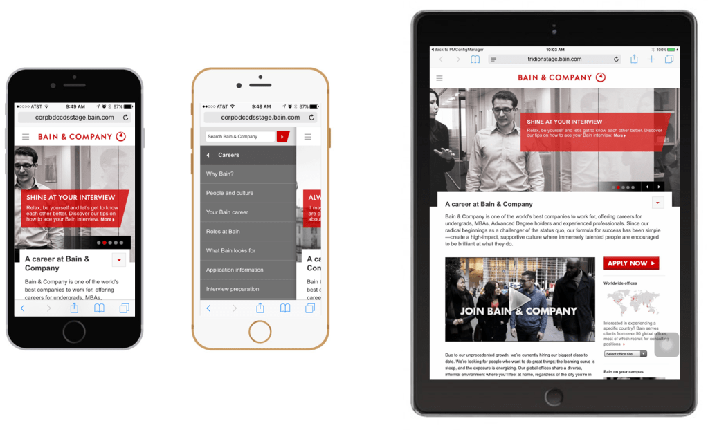
A Poor Mobile Experience
While the primary Bain & Company website for clients was mobile optimized, the JoinBain recruitment website was not. Quantitative analysis of the website showed the following:
- In the past 12 months, mobile & tablet devices made up 17% of overall views to JoinBain
- Compared to the previous year, number of mobile sessions have grown 75% (211,402 vs 120,264)
- 16% of sessions are on a Mobile or Tablet device, however on average half of all those visitors leave the site immediately after landing
This helped validate the growing audience on mobile/tablet, and the growing need to present a design that would allow those visitors to find the content they were looking for.

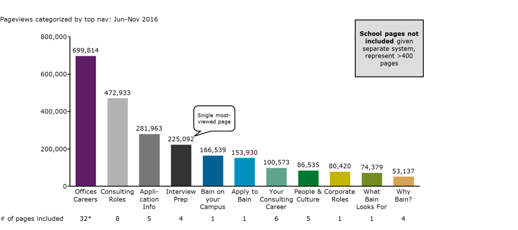
Website Analytics
After reviewing the current website constraints, analysis was done on the website to find what content users were visiting most frequently. What we found was career Pages on offices, roles, application and interview info are most popular while marketing and advertising material was not as viewed. Additionally we found:
- Referral traffic brought in the highest number (362,640/679,376) of new users to JB
- 68% of all referral traffic is from Bain.com
- Average bounce rate for bain.com referrals to JoinBain is 33% – over 160,000 recruits lost?
Presenting Design Strategy Options to Stakeholders
The following strategy options I presented to key business segment stakeholders after conducting the website quantitative analysis and speaking with product owners across multiple teams including IT, Recruiting/Design, and Corporate Marketing.
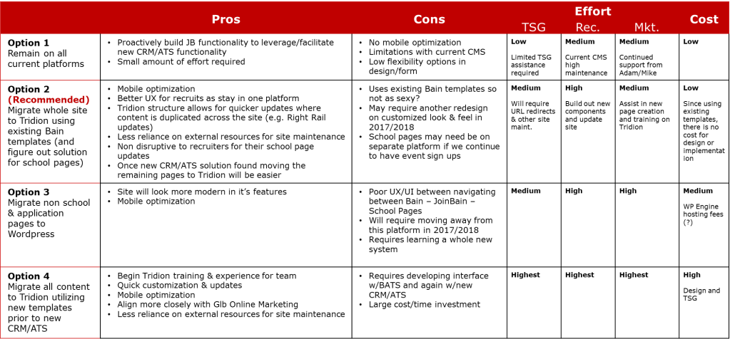
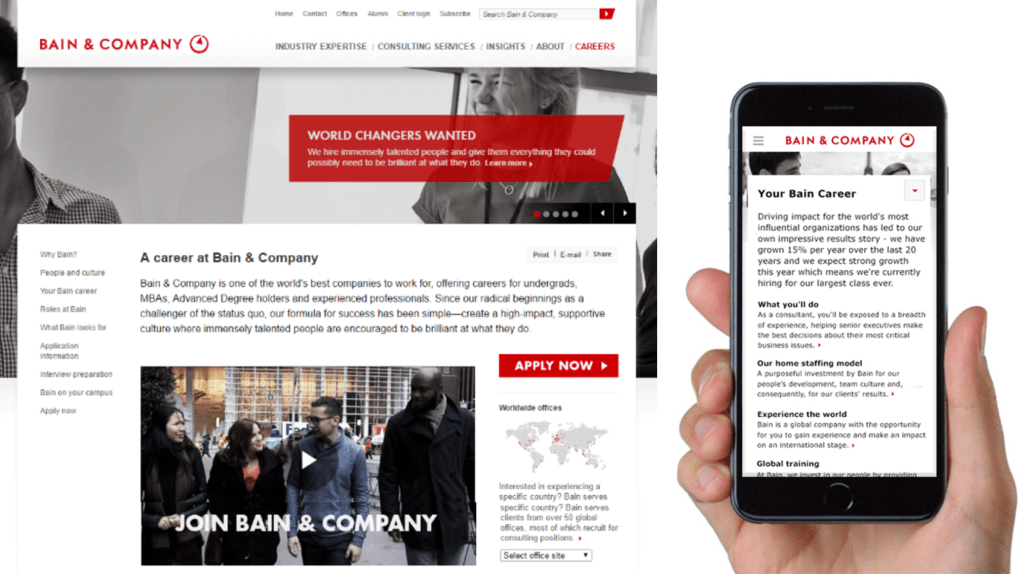
Ultimately I was able to convince stakeholders to move forward with my recommended design plan, which was to migrate the design of the Recruitment website to the corporate website, utilizing the existing design system and content management system. This allowed us to expedite the process, and save money by not having to create new custom templates that would have taken longer with additional resources.
Creating a Project Methodology and Timeline
Beginning in November 2015, this project lasted approximately eight total months with the new website design launching in July 2016. Below is a table of completed activities that show how we followed a design thinking lead process, focusing on quantitative analysis, internal stakeholder feedback, and usability testing.
| Phase | Activity | Description | Completed |
|---|---|---|---|
| Research | Competitive Analysis | Understand competitor offerings on school recruitment and consultant profile pages | November 2015 |
| Research | Stakeholder Interviews | Meet with current consultants employed at Bain to understand their journey as they went through the recruitment process | November 2015 |
| Research | Quantitative Analysis | Utilize google analytics and other platforms to understand key content areas and user behavior | December 2015 |
| Prioritization | User Flows | Create diagrams showing the path users typically take when researching and applying to Bain | December 2015 |
| Prioritization | Prioritization Plan | Prepare initial draft of planned design releases for business stakeholder review | January 2016 |
| Design | Wireframes | Starting with low-fidelity concepts, iterate and lead to pixel perfect high-fidelity wireframes that communicate user actions | February 2016 |
| Design | Design Shares | Collaborate with internal recruitment and marketing teams to ideate solutions | February 2016 |
| Design | Content Development | Collaborate with content writer to populate wireframes with updated and new content | March 2016 |
| Testing | Plan and Recruitment | Write and review usability script to test usability of the prototype while engaging business leads to identify and recruit the best and relevant consultants and stakeholders for product testing | April 2016 |
| Testing | Usability Testing | Gather an accurate sample of users to test the usability of the clickable prototype based on planned scenarios | April 2016 |
| Testing | QA Testing | Review performance of page, evaluating for any technical issues that would impact launch | May 2016 |
| Design | Wireframe Updates | Synthesize usability findings and make any design updates based on feedback from users or business stakeholders | May 2016 |
| Development | Agile Development | Collaborate with development team to discuss product backlog and address issues with data or design during the process | June 2016 |
| Development | Design Resources | Create internal documentation for recruitment teams and schedule demos to engage recruiters with new resources available | June 2016 |
| Development | Website Demo | Create presentations and host webinars for global recruitment teams walking through value add of new website changes | June 2016 |
Wireframes/Prototypes

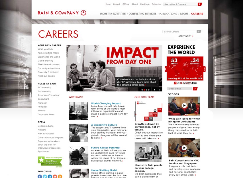
Step 1: Review Existing Careers Homepage
JoinBain, our recruitment website, was originally a microsite not connected to the corporate website. First step was to review this initial design to find what was working well and should be prioritized during the design process.
Step 2: Utilize Corporate Design System to Create New Wireframes for Homepage
This wireframe shows an early concept of how we could redesign the recruitment careers homepage using existing design system components.
When presented to stakeholders, initial feedback was the confusing left hand navigation, as well as the overbundance of text used on page that distracted from key priority areas.
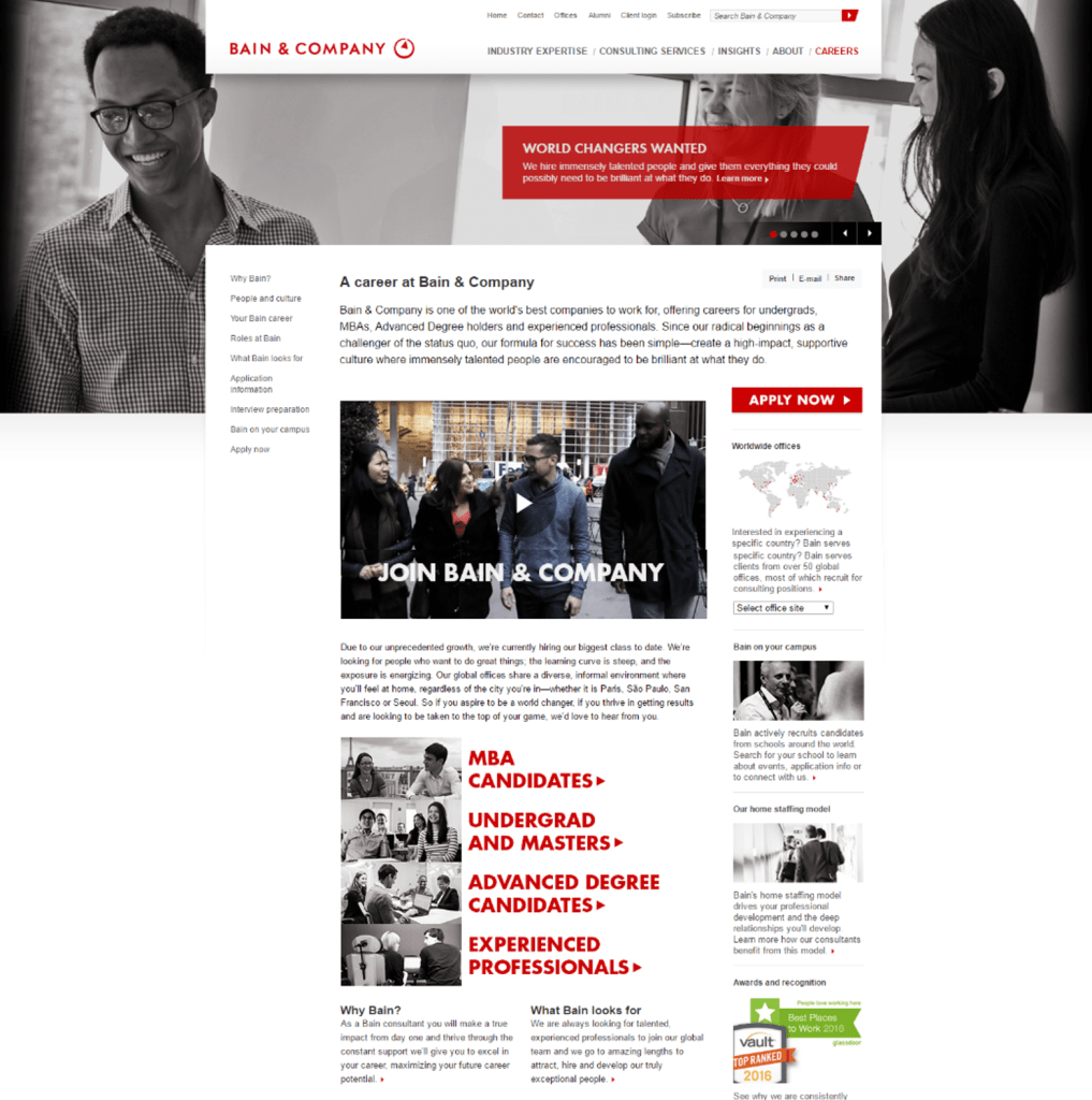
Step 3: Reiterate Homepage Design Based on User Feedback
This wireframe shows where our final design for the homepage landed. The navigation was simplified, and key calls to action were utilized in a carousel component to reduce information overload. As well, they Apply Now CTA button was made more prominent on page for users to quickly identify.
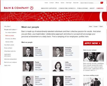
Step 4: Design of Additional Pages
This is an additional “Meet Our People” page that I redesigned for the new careers website. Original design had an overwhelming number of profiles available, so our designs focused on limiting those results to best represent a variety of global offices, schools, and consultant positions.
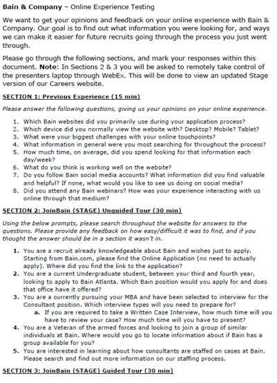
Usability Testing
Goal: To understand how the newly designed careers website presented information future recruits would be looking for, and ways we could improve the user flow and content.
Setup: 60-minute virtual sessions hosted on WebEx by UX Moderator and Observer.
Process: Participant first had a structured research section, answering questions focusing on their previous experience with the old recruitment website. We then provided users with a link to the new careers website prototype, giving them prompts and asking users to find answers on their own. In the last section, I moderated users through a guided tour of the prototype, focusing on individual sections of the website to ask targeted questions that would help impact our final designs.
Usability Testing Outcomes
- Left hand navigation was found to be confusing, resulting in a reduced structure focusing on high level categories
- Users were unable to quickly identify where to apply, leading to a “Apply Now” red CTA button placed in a more visible area on homepage and deeper level content
- Homepage was described as “busy/overwhelming” leading to a simplification of content.
- Users unclear where to look for content based on education level, resulting in specific call outs for “MBA Candidates”, “Undergrad Candidates” and “Experienced Professionals”
Outcomes
- A better mobile experience with recruits able to quickly access and find content thanks to responsive design components
- Improved information architecture that minimizes the time needed to be spent finding priority content
- Consistent branding experience between corporate website and careers content
- Easier method of content management with implementation of corporate marketing design system